
This explains some things (Ideological differences in the expanse of the moral circle):
Do clashes between ideologies reflect policy differences or something more fundamental? The present research suggests they reflect core psychological differences such that liberals express compassion toward less structured and more encompassing entities (i.e., universalism), whereas conservatives express compassion toward more well-defined and less encompassing entities (i.e., parochialism).
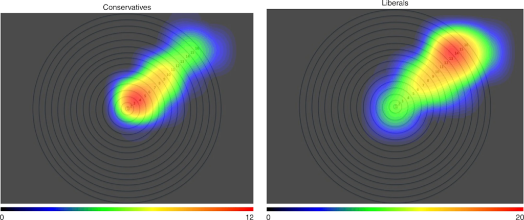
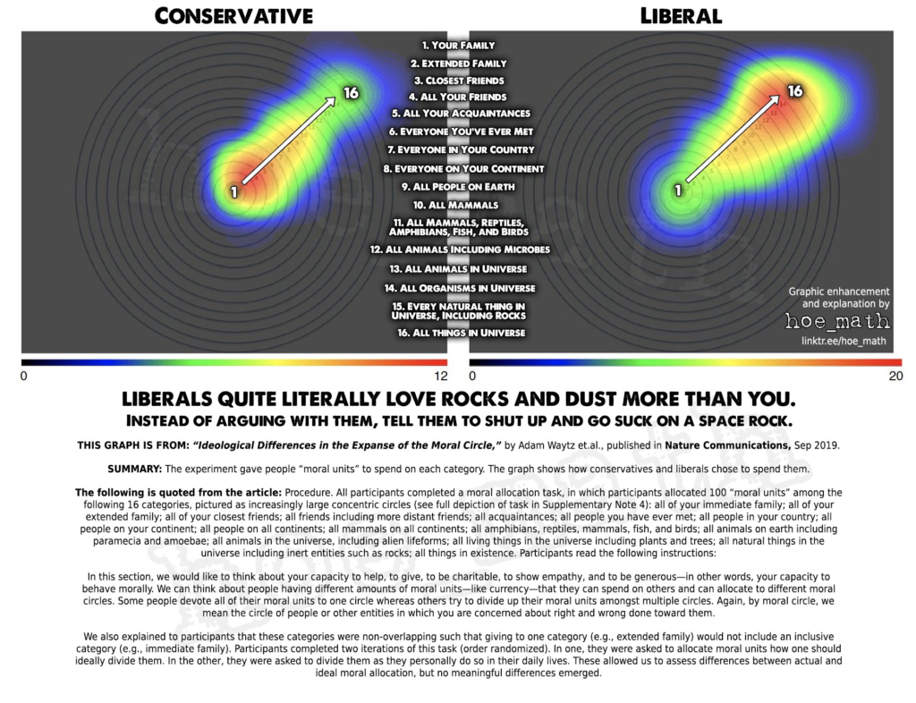
Heatmaps indicating highest moral allocation by ideology, Study 3a. Source data are provided as a Source Data file. Note. The highest value on the heatmap scale is 20 units for liberals, and 12 units for conservatives. Moral circle rings, from inner to outer, are described as follows: (1) all of your immediate family, (2) all of your extended family, (3) all of your closest friends, (4) all of your friends (including distant ones), (5) all of your acquaintances, (6) all people you have ever met, (7) all people in your country, (8) all people on your continent, (9) all people on all continents, (10) all mammals, (11) all amphibians, reptiles, mammals, fish, and birds, (12) all animals on earth including paramecia and amoebae, (13) all animals in the universe, including alien lifeforms, (14) all living things in the universe including plants and trees, (15) all natural things in the universe including inert entities such as rocks, (16) all things in existence
My guess is both the political left and right will see this, agree with it, and claim moral superiority over their political opponents.
Here is the interpretation from someone on the right:
Psychology is interesting in a frightening sort of way.
My takeaway is there is no compromise between the viewpoints. One might as well try to find an acceptable compromise between a murdering rapist and their intended victim.
I need my underground bunker in Idaho to be complete.
You’re not reading the graph correctly. As noted in the comments on the thread, this is a graph of scope of empathy, not intensity of empathy. According to this (and I’m dubious this is even valid data) liberals care about a broader range of things than conservatives do, but is says nothing about *how much* they care about those things. You need a separate graph to show intensity of caring by circle to draw the conclusion the meme-maker is drawing.
Put another way: I care about x, y, and z, you only care about x and y. We may both care about x equally much, I just add z to my list of things to care about.
Axe-grinding at its best.
Where did I say I interpreted the graph as relating to intensity of empathy?
I said someone on the political right interpreted it as I quoted them.
Fair enough. Whoever made the meme read the data wrong.
This is a fascinating exploration. I find it intriguing that liberals seem to include a wider moral circle, extending compassion all the way to the universe, whereas conservatives seem more grounded in a narrower scope. How do you think this affects policy decisions, especially when it comes to issues like climate change or immigration?
It’s much easier to understand the difference in colloquial terms. Leftists are inherently insane. There…that was easy wasn’t it.
…and conservatives don’t know how to read data and/or charts.
Wow, you’re right…this *is* easy!
This black and white world you live in is fun. I’ll have to come here more often.
“Finally, we assessed the heatmaps generated by participants’ clicks on the rung they felt best represented the extent of their moral circle. These qualitative results also demonstrated that liberals (individuals who selected 1, 2, or 3 on the ideology measure) selected more outer rungs, whereas conservatives (individuals who selected 5, 6, or 7 on the ideology measure) selected more inner rungs (see Fig. 5). Overall, these results suggest conservatives’ moral circles are more likely to encompass human beings, but not other animals or lifeforms whereas liberals’ moral circles are more likely to include nonhumans (even aliens and rocks) as well. Study 3a revealed these patterns also when asking about participants’ ideal moral circles. This suggests that both liberals and conservatives, although differing in their moral allocations, feel that their pattern of allocation is the ideal way to adjudicate moral concern in the world.” (Explanation for the graphic Joe included)
What the absolute f*ck is that graph supposed to do?
What is the X and the Y of that 2D graph supposed to convey? Why not slant it the other way, or exactly 128.5 degrees to the right so the “liberal” end is downwards?
Heat maps make sense when there is 2 measured or quantified independent axes and you’re trying to convey a third dimension which is a dependent measurement based on the first two.
That explanation is not for two independent axes. That’s ONE axis of continuous shades of subjective scored grouping on a narratively distinct axis by 16 bins of non-inclusive categories of how “near” or “far” something is from being identical to you, with close family being as close to you as possible without being you, and non-differentiated ‘everything in the universe’ being the other end of the scale.
And this is where putting on the white coat and fiddling with a sliderule and having some Erlenmeyer flasks with colored liquid in them bubbling with dry ice in the background as you explain your sociology or psychology paper pisses me right the f*ck off.
Right representation of binned data on a single approximately continuous axis? A bar graph. A nice, boring bar graph. Not a continuous line graph that falsely gives the impression of continuity of measurement that doesn’t exist in the methodology. You’d even be able to more properly explain that the maximum magnitude on one chart is 20 for liberals (more extreme) and 12 for conservatives (less intensity). That’s not a value judgement of the conservative vs liberal results, simply a distinction that is very difficult to intuitively grasp from their chosen form of representation. And it’s a distinction that might have been worth some commentary, even if an explanation is avoided!
As someone that has seen a lot of charts and slides in my time, when I see a graph for a type of data that doesn’t match the methodology, I immediately get suspicious that someone is trying to gee-whiz me with fancy graphics and loosey-goosey data that is not significant but they desperately want it to be to persuade me of something. Looking at the rest of the paper tells me what they’re trying to persuade me of: They’re trying to persuade me that they are doing science, when what they are doing is tarting up their politics with numbers.
Read their source: “Three thousand three hundred sixty-four participants (1791 male, Mage = 34.94, SD = 13.64) completed the study on the YourMorals.org website.” Congrats, you did a survey of people willing to go into a website titled “Your Morals dot org”, self-reporting age, gender (one of two!), their own subjective view of their political ideology, then the game they were asked to play. “There were 2619 liberals, 347 moderates, and 398 conservatives.” Great, nice skewing of the surveyed population, wash that out by normalizing the data relative to the weighting of the ‘coins’ the participants had to allocate, easy enough, sum all the coins per bin and divide by population size… where’s the output for the moderates? They showed self-reported conservative and liberals (why not ‘progressive’?)… where is the chart of the outcome for the group almost as big as the ‘conservative’ population?
Conclusions:
1) They have science envy and they very much want to toss out things like “standard deviation of median age” so they can be taken seriously
2) Read the references at the bottom of the paper and tell me you think this is going to be an even handed and sober analysis. Try “Dhont, K. & Hodson, G. Why do right-wing adherents engage in more animal exploitation and meat consumption? Pers. Indiv. Diff. 64, 12–17 (2014)” on for neutrality and non-judgmental analysis. Maybe they threw that in to kiss the ass of an adviser.
3) The fact that this passed any kind of review by any experimental review board is a damnation of the entire psychology/sociology academic field, Nature as a ‘scientific’ journal, four colleges/universities, oh, and Facebook, the affiliation of one of the authors.
AND ANOTHER GODDAMNED THING…
I was wondering why the number of conservative respondents looked familiar…
Then I remembered: How many people do you need to survey for your questionnaire to be statistically significant? There’s a handy explainer website to use: How To Choose A Sample Size. My background in statistics is more scientific, how to calibrate an instrument, how to analyze data on multiple channels sampled six times a minute, binning results across two dimensions as a first-pass analysis to see if anything interesting pops up (turns out, when the prof asks you for a 5×5 grid and you do 9×9 to smooth out the edges and have a place to bin the outliers, prof may go “whoa… what the hell is that?” when he sees stuff outside his area of interest that he didn’t expect), BUT I was helping my daughter with her college statistics class and that material had a lot more survey analysis in it.
So… why 398 ‘conservatives’? And why 2619 ‘liberals’?
Let’s check the guidance from that web page… population under 100, interview them all; larger population that that, get 10%, but not to exceed 1000 respondents. Remember, you’re trying to survey enough respondents so you can be sure you have enough samples so they can represent the views of the larger population without doing so much work, within a statistical degree of certainty. Standard is 95% confidence (within approx 2 standard deviation), thus a ±5% chance of the group of respondents not representing the larger population. Oh, wait! They have a chart because “sometimes you need to sound more “scientific” in order to be taken seriously“. Well! We want to be taken scientifically seriously! So, if I want to survey a group of people to represent a much larger group with the standard error of ±5%, I read off the chart and it’s… 384 respondents to represent any population over 5000 people. Guess they got 398 ‘conservative’ respondents and said, YUP, that’s all we need to represent all the ‘conservatives’! Good ol’ scientific rule of thumb!
But, the explainer page said don’t collect more than 1000? Why 2619 ‘liberals’? Not hard to figure out. They kept throwing people at the website, and they kept getting ‘liberals’ coming out their ears. They wanted to have a ‘scientific’ paper, and they can’t do ‘liberals’ versus ‘conservatives’ until they have more than 384 of each. So they had to keep accumulating ‘liberals’ until they went over their ‘conservative’ minimum. Then, they had no statistical method to winnow down that 6.6:1 response rate (guess they had no easy to mine veins of ‘conservatives’ to mine in their social circles or geographic area) so they just included all the data.
What about the 347 ‘moderates’? They’re under the 384 boundary! Well, either they ran out of money to keep running the survey, or they really weren’t all that interested in the ‘moderates’ for the purpose of the paper. Just smoothly slide past the fact that we have data but didn’t report on it…
So, now we have all these ‘liberal’ responses and just enough ‘conservative’ responses… we could break down the data further! We have the ages! We have the (one of two!) genders! We could further bin the data and maybe that circle graph could represent ages on a polar coordinate and gender basis! That would make a heat map make more sense!
Whoa there… that 384 number is a minimum for a respondent population that isn’t further subdivided. If you wanna split by gender, you need 768 respondents. If you want to split by, say, 5 bands of ages and 2 genders, you’ll need 3840 respondents! They have enough to do ‘liberals’ by ages, but not genders, but they can’t also split up the ‘conservatives’. Oh, and they’re ignoring the ‘moderates’, as they were not so important for the purpose of the paper that they went looking for data to support.
So, that’s how we got here. They had to keep digging until they met their adviser’s “scientific rule of thumb” for both categories they cared about for the narrative of their paper, could have kept going to get the third category up another few dozen but they didn’t care enough to take the time or spend the money. Similarly, they could have collected more so they could subdivide the data and made that heat map thing work, but no, they had enough trouble getting 398 ‘conservatives’ to respond on Your Morals dot org and they just don’t know where they’re going to find any more suckers, uh, respondents.